As we near the official launch of FRW Studios, it seems like a fine time to share the stories behind our name and logo. Just as we have been putting the time and effort into our strategic and business plans, the same consideration was given to our name and logo. It was a fairly organic process and I am happy to share it with you here.
 Name
Name
Lance and I have been discussing names for our business almost as long as we have known each other. With our complimentary skill sets, working together has always felt like a smart choice, not to be ignored. But picking a name really sent us in circles.
We both have strong opinions, and if something didn’t feel perfectly right, it was immediately dismissed. Using our last name White was not an option. Being a name that is also an adjective wasn’t going to work for us.
We had both spent over a decade on our personal brands (lancewhite.com and korowotny.com) and it didn’t feel right to chose one of those over the other, so the search for a name continued. It was a surprising challenge seeing as choosing a name for each of our daughters was a breeze.
And there it was…our daughters names. We chose to use each of their first initials (Frances and Reagan) combined with our last name (White) as our studio name. Before settling on this, we made sure that the URL and all related social media user names were available. We were especially adamant that we not have to use any additional words, hyphens, or variations of the name. We know how important a brand is and a compromise on these things was not an option for us (nor should it be for you!).
On a personal level, the name also reflects our values. Besides being kick ass designers, Lance and I are starting this business with our daughters in mind. We want to set a positive example for them, and to create something that we can leave in their capable hands one day. And so FRW Studios was born.
Logo
Ask any designer out there and they will most likely agree that designing for yourself is a complete pain in the ass. When creativity is your job, it is tough to ever reach a “finished” design.
Working with clients, their satisfaction or a deadline typically drive that “finished” conclusion. But when the client is yourself, it’s hard to EVER call it done. So in the case of FRW Studios, throw in the fact that my client is not just me, but my husband as well, and I was pretty sure we were screwed.
Lance and I tend to agree on quite a bit, but his design preferences lean towards a minimalistic, modern, masculine feel. While I prefer a more classical look with pops of eclectic. Yet, someway, somehow, the design gods shined down on us and we arrived at our final logo design rather easily.
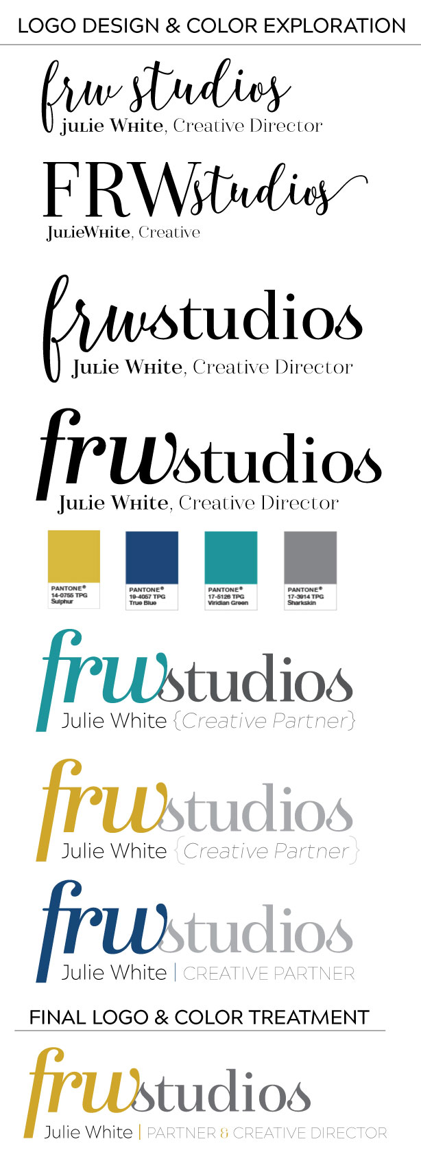
The main font for FRW is called Isabel. It provides a unique identity, offering plenty of intrigue. The lovely curves of the the lowercase immediately drew us both in, while the hint of classic serifs really appealed to our sensibilities.
This was the driving force behind choosing to keep the lowercase treatment for the initials. It also alludes to the company name being derived from our young daughters initials. A stiff uppercase just wasn’t reflective of them!
We made custom adjustments to each letter to further personalize the logo—such as extending the f down below it’s natural baseline and joining it’s cross bar with the serif of the r. Snuggling the s from studios up against it’s reflected curve of the w further customized the type treatment and united the words as one mark. The size and color variation of the two elements ensures that it reads correctly.
The colors from our logo were inspired by Pantone’s 2017 color trend predictions. The masculine mustard balances out the feminine cursive of the font for a broad appeal. Our secondary color of navy which we use on our website and other printed pieces is a classic compliment to the gold. Both have that great balance of being bold but also a traditionally welcoming combination.
Note: Our slogan which is “A Damn Fine Design Studio” is possibly my favorite little nugget. The inspiration from this comes from the incomparable David Lynch and the classic line from Agent Cooper in Twin Peaks: “You know, this is – excuse me – a damn fine cup of coffee.” As huge fans, this nod to his creative genius felt both personal to us as well as reflective our out of the box personal tastes.


